How I made this website
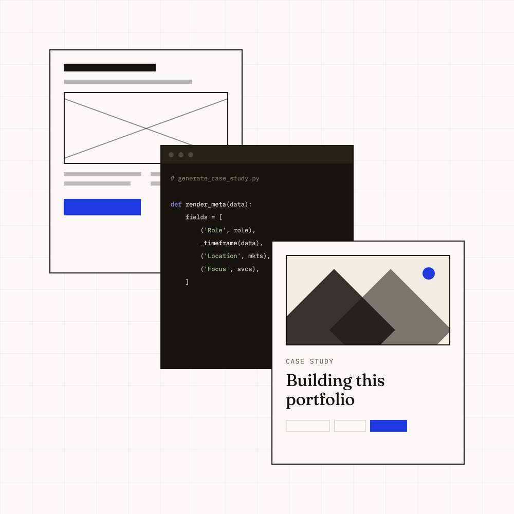
Designing and building an evolving portfolio with AI-assisted development and a custom content system.
Challenge
A portfolio template could not carry complex service-design work, and every change would have meant editing code.
Approach
Designed the system and its components, built the pages and the admin behind them, and directed the implementation.
Outcome
Live, and edited through its own admin rather than by hand.
Defining what the website needed to do
I wanted more than a portfolio template. I needed a flexible system that could communicate complex service-design projects, accommodate different types of content and remain easy to update without editing code.
What it had to do
A distinctive but restrained visual identity.
Flexible case-study templates.
Reusable content components.
A custom admin interface.
Responsive behaviour.
Control over interactions and animation.
The ability to develop and improve the website independently.
Starting with ideas, not templates
The process began away from the screen. I wrote down what the portfolio needed to communicate, collected references and sketched different ways of organising projects, stories and supporting material.
Workflow
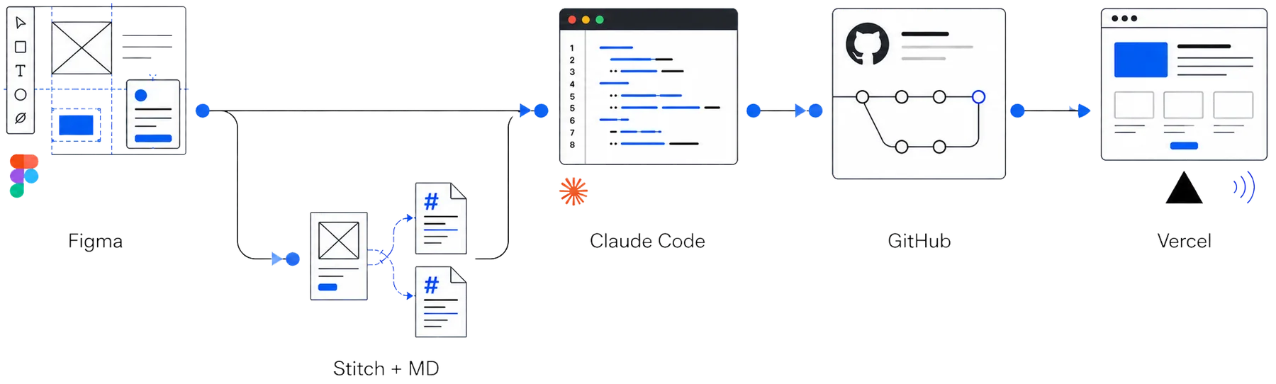
I designed the interface in Figma, then used Stitch to translate the visual direction into Markdown guidance for implementation. Claude Code worked from these files and the existing design system to build and refine the website. Each approved version was saved to GitHub, with Vercel automatically publishing the latest update.
Visual language
These early experiments shaped a visual language connected to the way design work actually happens.
Cobalt blue

Works like marker ink: it highlights decisions, active elements and important moments in the story.
The grid
Recalls graph paper and working canvases. It provides structure while keeping the process visible.
Cards
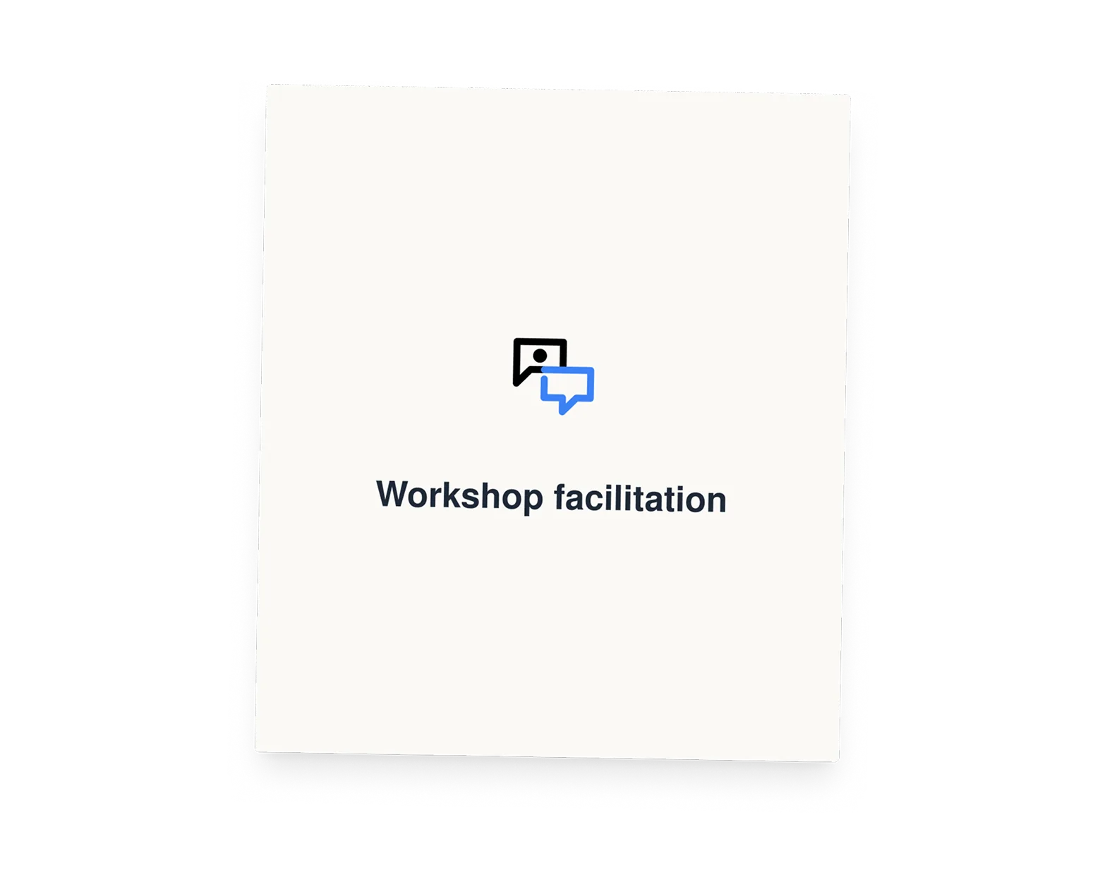
Are inspired by movable notes used during research and workshops. They can be rearranged, turned over and connected.
<script>
/* Decides before the first paint whether the entrance animation runs */
(function(){
  try{
    if(sessionStorage.getItem('introPlayed')) return;
    if(window.matchMedia('(prefers-reduced-motion: reduce)').matches) return;
    sessionStorage.setItem('introPlayed', '1');
    document.documentElement.className += ' has-intro';
  }catch(e){ /* private mode with storage disabled: just skip the intro */ }
})();
</script>Entrance animation
/* ---------- entrance animation ---------- */
.intro{ display:none; }
.has-intro .intro{
  display:block; position:fixed; inset:0; z-index:300;
  background-color:var(--paper);
  background-image:
    linear-gradient(rgba(21,20,15,0.055) 1px, transparent 1px),
    linear-gradient(90deg, rgba(21,20,15,0.055) 1px, transparent 1px);
  background-size:32px 32px;
}

/* Origin point with pulsing ring */
.intro-dot{ fill:var(--signal); transform:scale(0); transition:transform .42s cubic-bezier(.2,.7,.2,1); }
.intro-dot.is-on{ transform:scale(1); }
.intro-ring{ fill:none; stroke:var(--signal); stroke-width:1.5; opacity:0; }
.intro-ring.is-on{ animation:intro-pulse 1.5s cubic-bezier(.2,.7,.2,1) infinite; }

@keyframes intro-pulse{
  0%{ transform:scale(.4); opacity:.85; }
  75%{ transform:scale(3.2); opacity:0; }
  100%{ transform:scale(3.2); opacity:0; }
}

/* Drawing lines */
.intro-line{
  stroke:var(--signal); stroke-width:1.5; fill:none; stroke-linecap:round;
  stroke-dasharray:var(--len); stroke-dashoffset:var(--len);
  transition:stroke-dashoffset var(--dur,.9s) cubic-bezier(.2,.7,.2,1) var(--delay,0s);
}
.intro-line.is-drawn{ stroke-dashoffset:0; }

/* Card nodes */
.intro-node{
  fill:var(--signal); transform:scale(0); transition:transform .34s cubic-bezier(.2,.7,.2,1) var(--delay,0s);
}
.intro-node.is-on{ transform:scale(1); }

/* Cards appearing */
.has-intro .intro .hcard{
  opacity:0; transform:scale(.84);
  transition:opacity .72s cubic-bezier(.2,.7,.2,1), transform .72s cubic-bezier(.2,.7,.2,1);
}
.has-intro .intro .hcard.is-placed{ opacity:1; transform:none; }
.has-intro .intro .hcard.is-selected{ transform:scale(1.05); }

/* Blue flood effect */
.intro-flood{ display:none; }
.has-intro .intro-flood{
  display:block; position:fixed; z-index:301; border-radius:50%;
  background:var(--signal); pointer-events:none;
  width:var(--d); height:var(--d); left:var(--x); top:var(--y);
  transform:translate(-50%,-50%) scale(0);
  transition:transform .85s cubic-bezier(.65,0,.35,1);
}
.has-intro .intro-flood.is-full{ transform:translate(-50%,-50%) scale(1); }
.has-intro .intro-flood.is-out{ transition:opacity .45s ease; opacity:0; }Designing the system
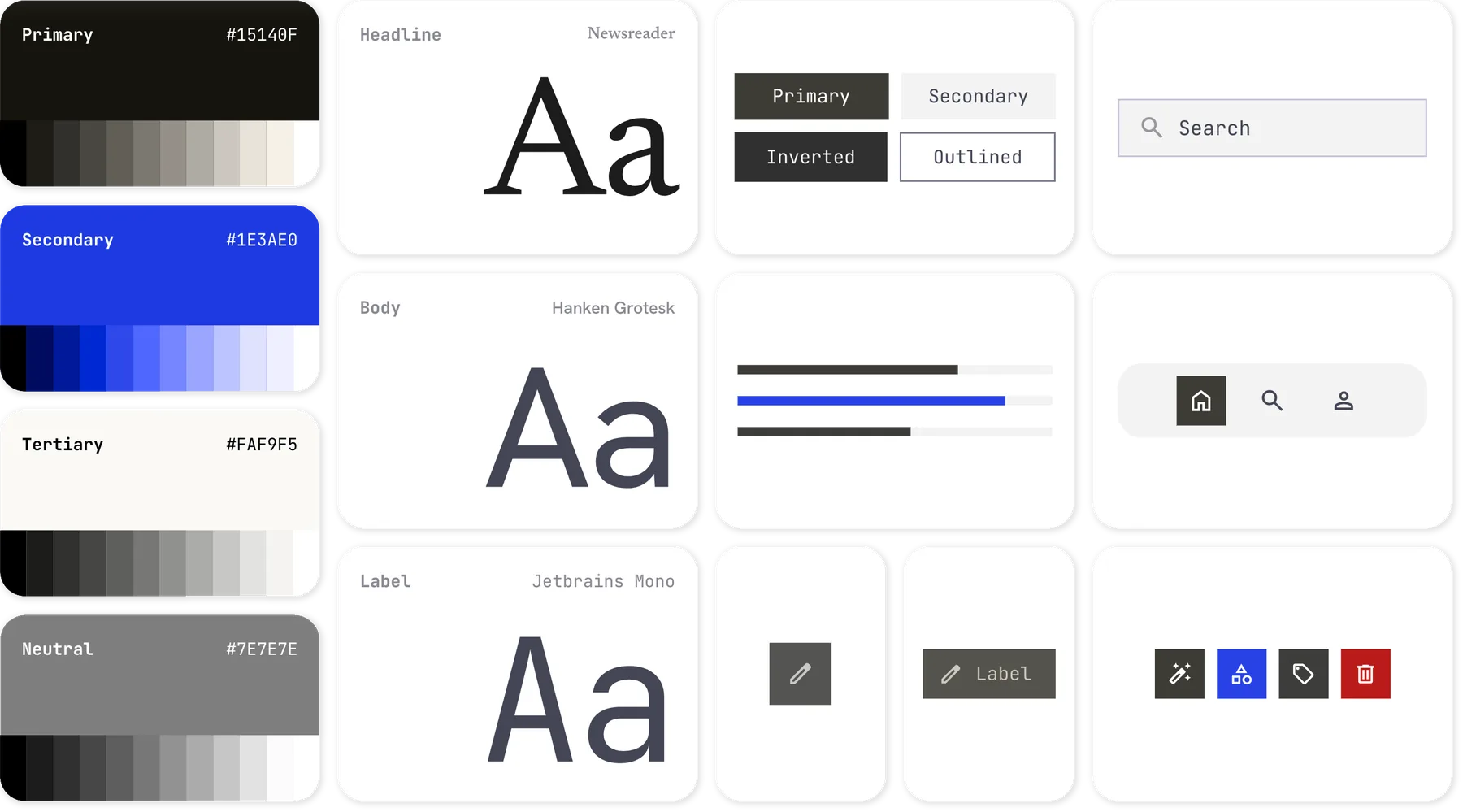
I treated the website as a product, defining shared rules for colour, typography, layout, components and motion. I documented them in a Markdown file that acts as a common reference for both me and Claude Code, keeping every new page consistent while allowing the system to evolve.
# Design system — paper and ink

The rules this site is built from, written from the code rather than from
intent. Every value below is one that ships.

## Colour

**Paper and ink.** `--paper` `#FAF9F5` is a warm off-white; `--ink` `#15140F` is
a near-black with a green cast. Neither is neutral grey, and pure white and pure
black appear nowhere.

**One accent.** `--signal` `#1E3AE0` carries links, focus rings, the selected
card, the icon accents and the entrance animation. It is never used for large
areas — the closing wipe of the intro is the only exception, and it lasts under
a second.

**Text on ink.** Dark surfaces (footer, code panel, the colophon band) use a
fixed ladder rather than opacity: `#D6D3C7` for text, `#C9C6BA` for body copy,
`#B7B4A8` for muted labels, `#7A7768` for the faintest, `#54524A` for rules that
should read as structure and `#33322A` for dividers. `--ink-soft` and `--line`
are tuned for paper and all but vanish on ink; reach for this ladder instead.

## Typography

Three families, each with one job:

1. **Fraunces** — headings and statements. Weight `420`, not `400`: the site
   uses the variable axis a little above regular throughout.
2. **Instrument Sans** — body, navigation, buttons, card labels.
3. **IBM Plex Mono** — eyebrows, captions, metadata, code, the footer copyright.
   Uppercase with `0.08–0.12em` tracking wherever it acts as a label.

Sizes are `clamp()` throughout — there are no fixed pixel type sizes and no
breakpoint-specific overrides except where a component needs one.

Fonts are self-hosted from `/assets/fonts/`, with the two display faces
preloaded. Nothing is fetched from a third-party CDN.

## Layout

`--maxw: 1350px`, side padding `--gutter: clamp(1.25rem, 4vw, 4rem)`.

Case-study chapters run on a **12-column grid**, driven by three variables
rather than per-block rules: `--lead-span: 4`, `--stream-start: 6`,
`--stream-span: 7`. Change those and every chapter layout follows.

Breakpoints in use: `1180px`, `1080px`, `900px`, `860px`, `760px`, `640px`.
`900px` is the meaningful one — below it the site treats the device as touch
and drops the custom cursor and hover-only behaviour.

**Full-bleed backgrounds.** A section that carries the grid texture must not
have `max-width`, because that clips the background with the content. Use
`padding-inline: max(var(--gutter), calc((100% - var(--maxw)) / 2 + var(--gutter)))`
instead — the measure is held by the padding.

## Surface and depth

The grid texture is the signature: two `linear-gradient` rules in
`rgba(21,20,15,0.055)`, `background-size: 32px 32px`. It marks the hero, the
work grid, the capabilities and thinking sections, and every case-study hero.

**Corners are square** for surfaces — cards, images, code panels, buttons.
Pills (`border-radius: 999px`) are used only for small chips: project tags,
stat markers, service labels. Circles are reserved for the custom cursor, the
carousel dots and the intro nodes.

**Shadows exist, sparingly.** The homepage capability cards carry
`0 16px 34px -20px rgba(21,20,15,0.28)`, deepening to
`0 22px 44px -18px rgba(21,20,15,0.34)` on hover. Everywhere else, depth comes
from a 1px border or a change of background.

## Components

- **Capability cards** — `aspect-ratio: 1/1.08`, `perspective: 1100px`, 1px
  `--line` border. Odd cards sit at `-1.4°`, even at `1.2°`. Flip is driven by
  `aria-pressed` on the button, not by a class. Selected state:
  `3px dotted var(--signal)` plus a blue glow.
- **Buttons** — `1px solid var(--ink)`, square, `0.85rem 1.6rem`. Primary is ink
  on paper; both lift `2px` and turn `--signal` on hover.
- **Text links** — `.link-arrow`: `0.95rem`, weight `500`, 1px underline in
  `--ink`, both text and rule turning `--signal` on hover.
- **Code** — dark panel, mono, sticky unselectable gutter, scrolls on both axes.
  No syntax colouring by design.
- **Placeholders** — any block can be flagged `placeholder: true` and renders a
  marked box instead of empty space.

## Motion

Only `transform` and `opacity` are animated, so everything stays on the
compositor. `--ease: cubic-bezier(.22,.61,.36,1)` for entrances; `.3s ease` for
hovers.

Entrances are opt-in per element via `data-anim="head|body|media"`, revealed by
one IntersectionObserver with a failsafe that shows anything still hidden after
three seconds — content being visible always beats animating it.

All scroll-driven work runs in **one** rAF-throttled pass. Do not add a second
scroll listener.

`prefers-reduced-motion: reduce` is honoured everywhere: animations and
transitions collapse to `0.001ms`, revealed elements are forced visible, sticky
panels unpin, and the homepage entrance animation does not run at all.

## Where the design system actually lives

Three stylesheets, each written as a string in Python or inline in HTML. The
source of truth is the code, not a `.css` file — the files under `/assets` are
build output.

| source | serves | published as |
|---|---|---|
| `index.html`, inline | the homepage | stays inline |
| `tools/generate_about.py`, `CSS` | About, Privacy | `assets/site.<hash>.css` |
| `tools/generate_case_study.py`, `CSS` | 16 case studies | `assets/case-study.<hash>.css` |

`generate_privacy.py` imports About's stylesheet; it has none of its own beyond
a handful of page rules that stay inline. Case studies share nothing with
About — the two are separate stylesheets that happen to agree.

**The published files carry a content hash, and that is load-bearing.**
`vercel.json` serves `/assets/*` with `max-age=31536000, immutable`. A
stylesheet at a fixed name would be pinned in readers' browsers for a year and
no edit would reach them. `tools/asset_css.py` writes the hash into the name and
sweeps old builds once no page points at them.

## Tokens

Colour
  paper              #FAF9F5
  ink                #15140F
  line-strong        #15140F
  signal             #1E3AE0
  signal-dark        #152B9E
  on-ink-text        #D6D3C7
  on-ink-body        #C9C6BA
  on-ink-muted       #B7B4A8
  on-ink-faint       #7A7768
  on-ink-rule        #54524A
  on-ink-divider     #33322A

Type
  Fraunces           chapter-title, hero, section-title, statement
  Instrument Sans    body
  IBM Plex Mono      caption, label

Space
  max-width          1350px
  gutter             clamp(1.25rem, 4vw, 4rem)
  measure            68ch
  header-height      76px
  grid-texture       32px
  case-study-columns 12
ease cubic-bezier(.22,.61,.36,1)Building the publishing engine
Once the visual system was defined, the next challenge was making it easy to use and maintain.
Pages

Each case study is stored as structured content and edited through the custom admin rather than directly in HTML.
Generation
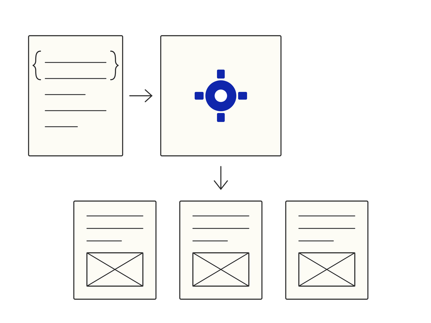
A shared Python generator turns those records into static pages. Updating a renderer improves every project that uses it.
Delivery
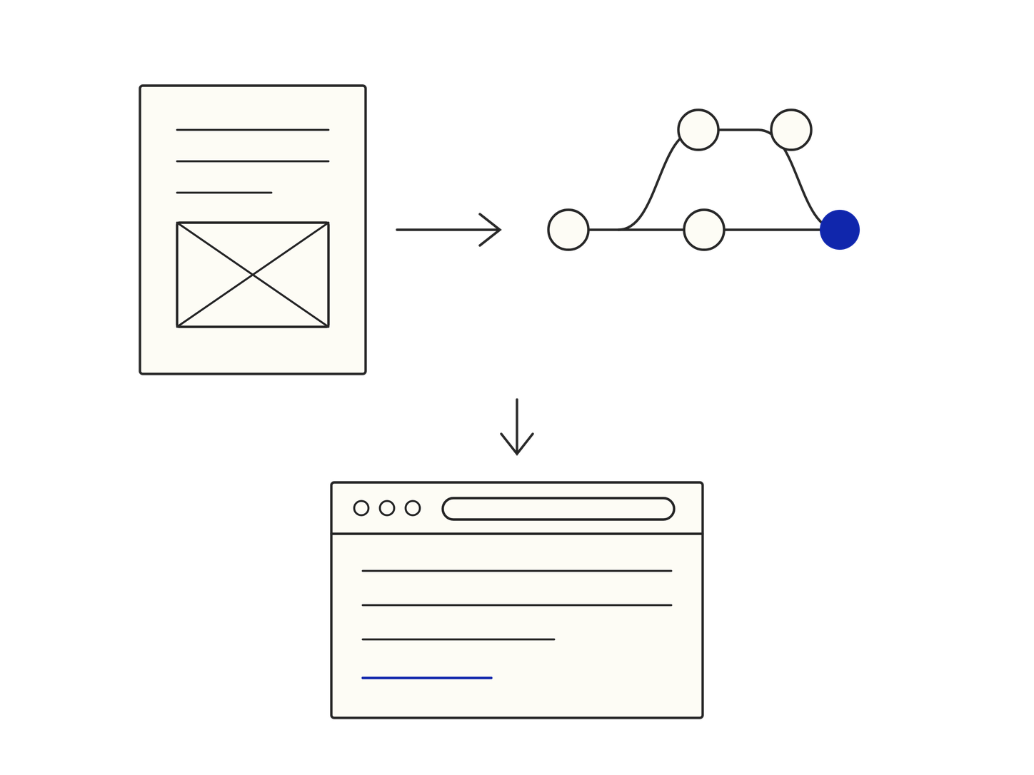
Images are resized during upload, while completed pages are versioned through GitHub and published automatically on Vercel.
# iuliiavorobiova.com

A portfolio that is also its own publishing system: static pages,
generated from records, edited through an admin built for them.

## What is where

- `index.html`          the homepage, hand-authored
- `about.html`          generated by `tools/generate_about.py`
- `<slug>.html`         one page per case study
- `data/<slug>.json`    the record a case study is generated from
- `admin.html`          the editor, served by `tools/admin_server.py`
- `images/uploads/`     pictures, converted and resized on upload

## How a case study becomes a page

1. Content is written in the admin and saved to `data/<slug>.json`
2. `tools/generate_case_study.py` renders that record into a page
3. Each section picks a layout from the blocks it carries —
   a section holding media scrolls, one holding only text can pin
4. The page is committed and served as a static file

## Content blocks

richText            twoColumnText       quote
statsOutcomes       insightCallout      threeColumns
imageWithCaption    imageGallery        mediaMosaic
beforeAfter         imageSlider         video
projectProcess      appStoreLinks       nextCaseStudy
scrollableMobileGallery                 code

Adding one means a renderer, a registry entry, its CSS, and the
matching fields in the admin. Nothing else has to know about it.Custom admin
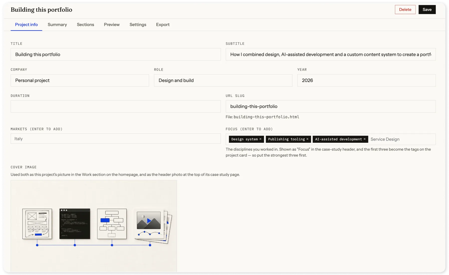
The admin brings the entire publishing workflow into one place. I can manage project details, assemble and reorder chapters from reusable content blocks, preview changes, control publication status and homepage position, and export the finished case study without editing HTML.
Outcomes
Faster publishing
The purpose-built templates and reusable content blocks make creating a new case study roughly twice as fast as assembling it in a general-purpose website editor.
Full creative control
I can design and add new bespoke content blocks whenever a project needs them. Each one follows the shared rules documented in DESIGN.md, so custom layouts still feel part of the same system.
Easier to evolve
Because content, components and visual styles are separated, the portfolio can be redesigned or restyled in the future without rebuilding every case study from scratch.
Looking for more detail on this project, or have a similar challenge in mind?